Long Life, Loose Fit

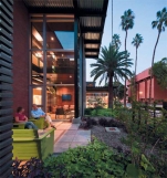
The Arizona State University Health Services Building (ASU HSB) is an adaptive reuse project that transformed the existing sterile and inefficient health clinic into a clearly organized, efficient, and welcoming facility. The design imbues the new facility with a sense of health and wellness that leverages Tempe’s natural environment and contributes to a more cohesive pedestrianoriented campus.
During the initial sustainability charrette the design team, owner, user groups, student representatives, and consultants established the goal of meeting the 2012 target for the 2030 Challenge. Through an integrated process, a series of incremental efforts including the elimination of thermal bridging, increased thermal barriers, highefficiency mechanical systems, strategically located and highperformance glazing, and effective daylighting contribute to the building’s 49% energy reduction below ASHRAE 90.1-2007, exceeding the current target of the 2030 Challenge.
The design also takes a “big picture” approach to sustainable design through its approach to campus and biophilic design. First, the design team reconsidered the planning concept approved by the university and recommended an alternative concept that reduced program by 12% and project footprint by 20%, preserving 5,000 square feet of green space for wellness programming. Second, from material selection, access to daylight, and the use of programmed landscape space, the design reinforces the relationship between occupants and the natural environment. The project’s biophilic design significantly contributes to the owner’s primary goal of deinstitutionalizing the facility and fostering a sense of health and wellness within a welcoming environment that would change the students’ perception of a “health clinic” and encourage the adoption of “healthy lifestyles.”
Metrics
Energy efficiency of building is 49% below the ASHRAE applicable standards and has significantly better performance, than is planned for 2030.
Regional/Community Design
The project engages and activates the historic Palm Walk, the campus’s pedestrian main street, resulting in a more vibrant and cohesive campus fabric. Whereas the disjointed existing building provided little order for the Palm Walk, the transformed facility’s main entry pavilion directly engages the pedestrian core, welcoming students under shady porches and a vine-planted trellis.
The new entry pavilion is located at the intersection of a pedestrian bridge, the Palm Walk, residential core, and the campus’s main city street with several bus stops and light rail nearby. As a result, the site has become a campus portal where pedestrians transition from bus, car, light rail, and bicycle at the pedestrian core. The site is reinforced with secure bike and skateboard racks, serving over 17% of the facility’s occupants.
Metrics
Estimated percent of occupants using public transit, cycling or walking: 80%.
Full content of this issue you can read here
The full version of the article can be read in our printed issue, also you can subscribe to the web-version of the magazine
 Materials provided by Lake | Flato Architects
Photos: Bill Timmerman


