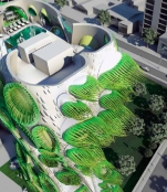
House with Cilia

The conceptual frame work for this project developed out of a clear interest in emphasizing an Architecture that can exist between nature and technology. An architecture that is inspired by patterns, movement and color appearing in nature, and that can evolve into an interactive and intelligent building organism. Just within this conception was solved a Housing Tower in Lima, Peru, called “Animated Apertures”. According to the architects, its design aesthetic is based more not on widely common digital designs that the firm wished to avoid. Animated apertures (diaphragms) – are similar to the structural elements of the lens, regulating quantity of light passing through it.
The building embraces a design aesthetic, which repudiates homogeneity and parametric smoothness as the default solution of digital design and instead advances a sense of incongruence, disruption and deformation within a larger massing idea.
“Animated Apertures” started out as a design research project that aimed to redesign the DNA of the window in terms of its function, components, appearance and materiality and apply it to a multistory housing typology.
Besides the configuration and stacking of units, apertures are one of the most essential components for this building type. They have the potential to dramatically change the spatial experience for each housing unit as well as the exterior perception of this building within the skyline of the city.
DESIGN FEATURES
According to the design approach, the window not as a flat, glazed surface, but as a three dimensional object that is inserted into a larger building mass. The apertures, which are directional in their geometry, are aimed at specific points of the surrounding context (the ground, the sky, the horizon, landmarks in the city, etc.), while at the same time operating as a transitional spatial element between the interior and the exterior.
The frame of the window was another component that we rethought not only in terms of its shape (rectilinear or amorphic) or its orientation (horizontal, vertical or diagonal) but its edges. There are a few examples in architectural history that aim to dissolve or blur the edges of a building, such as John Hejduk’s House of the Suicide, the sculpture from the collection of the Whitney Museum of American Art in New York.
The architects wanted to expand this idea to the window frame itself which usually frames the surrounding context with a hard outline. Their aim was to create a loose frame that moves and changes its shape and whose edges are able to respond to environmental forces, such as sun and wind, exploiting the latent potential of energetic exchanges between the natural and the built environment. These conceptual goals became the driving parameters for the design process.
Full content of this issue you can read here
The full version of the article can be read in our printed issue, also you can subscribe to the web-version of the magazine
 Materials provided by B+U Architects


