On the Crest of Architectural Trends

Inaugurated and opened to the public at the end of December 2013, the new “Le Creste” Cultural Centre in Rosignano Marittimo, in the province of Livorno, Italy, represents a paradigmatic case in the design scene of recent years. At a time of economic, social and cultural crisis, this new architecture designed by AREA PROGETTI and UNA 2 confirms that quality is possible and desirable in the creation of a public work, even at a time characterized by lack of resources and thanks to the committed participation of several parties.
The project objective, namely social impact and restructuring, together with the wish to perceive the space as a network of arteries connected to the urban fabric in order to integrate with it rather than act as a self-referential object, makes this work a new example, a possible, silent and effective alternative. Only a few weeks after its opening, the Cultural Centre has already become a meeting point for citizens.
The Culture Centre’s role in the territory
The building is located in the borough of Rosignano Solvay, in a rather anonymous and run down area, in any case lacking elements capable of sparking interest and renewing the urban scenario. The area is nestled between the historic centre of the village of Solvay, dating back to the early 1900s when industrialist Ernest Solvay built the plant for the manufacturing of soda and around it a real garden city, and the railway. This zone should be redeveloped and reconnected to the rest of the city so its inhabitants can perceive it as a new area vibrant with activity, starting with the Cultural Centre itself.
The physiognomy of the project
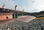
The Cultural Centre, a one-storey building, covers an area of 2,325 square metres and is surrounded by greenery making it barely visible especially where it borders the railway line, where the land has been raised in order to protect the reading rooms on a visual level and from noise. In that area, in particular, the structure can only be recognized by the “ridges” of the coloured ventilation stacks, a technological and attractive element which, together with the cooling tower, provides natural ventilation. The building is divided into three distinct blocks arranged along a covered pedestrian walkway used by those going to the library and those on their way to the nearby underpass, intended to finally open the city up to the sea.
The library is located in the largest block, the medium one contains a multi-purpose area, a youth information centre and a play room; and the smallest one has a cafeteria, which also includes a newspaper library. The layout of the building ensures that all the areas, arranged in the three distinct blocks, open onto the covered walkway.
Full content of this issue you can read here
The full version of the article can be read in our printed issue, also you can subscribe to the web-version of the magazine
 Materials provided by AREA PROGETTI and UNA 2
Photo: © Andrea Bosio


